Mountain Dew: Game Fuel
Project Focus:
Art Direction
+
Graphic Design
+
Creative Direction

Pepsico Worldwide
Chirag Bhasin, J. Walter Thompson
India
ART-DIRECTION ILLUSTRATION BRANDING ANIMATION MARKETING
Background
Mountain Dew Game Fuel is a charged energy drink made with caffeine, theanine, vitamins A and B, and a blend of ingredients called "Energy Amplifiers". It's designed to improve accuracy and alertness while gaming. However, in India it was a brand new product, that had to address the growing market of gamers in the country. With the advent of Mobile gaming this portion of energy drink/soft drink population was about to explode.
Approach
I was tasked with creating a unique packaging design. Inspired from the genesis of video games of the early 90s I created the packaging in a manner that it fits into every unit without leaving any space. Additionally, I created a custom Brand Identity inspired by the Pixel Art Style of the same era, creating a distinct link between the brand and it's audience.

Mountain Dew: Game Fuel
Art Direction
For the game, from the game
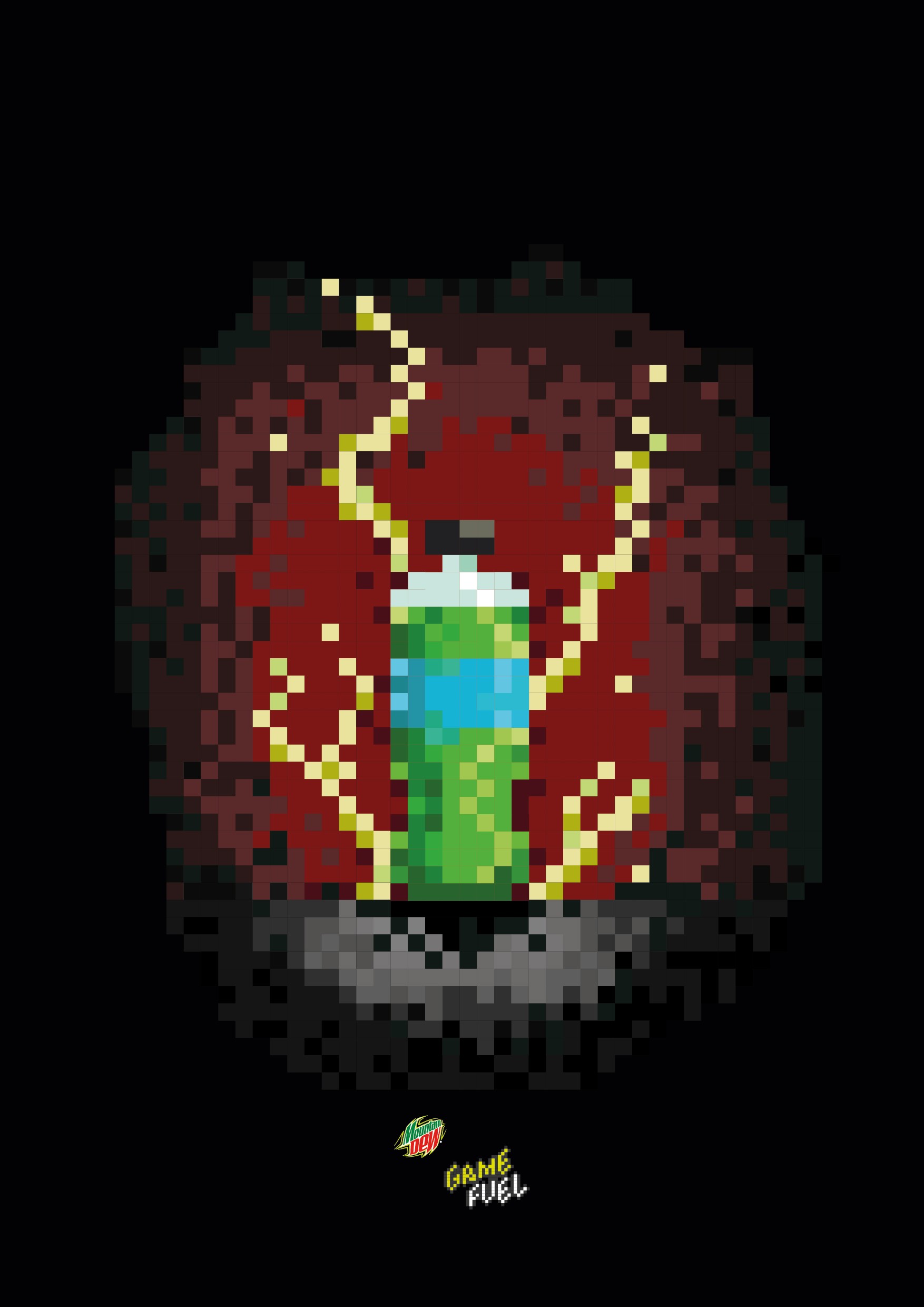
Inspired by video games like Super Mario bros., Sonic: the hedgehog, Mega Man, etc., I juxtaposed the classic mountain dew bottle with a power-up sprite, as used in games of that era. This resulted in beautiful pixel art renders that would also be used in its promotional material.

Straight Outta The Game.
To get the Pixel Design in the real world, I started with 3D Visualization. In essence, the bottle was too look like a power up in an offline physical environment.


A look for every level.
Keeping in mind the Pixel Art style, the branding for Game fuel had to be equally stylized in its form. Adding a halo effect for the branding, it looks like a power-up found in video games. To grab attention in stores and other points of contact, I designed these triptych posters that would be placed in sequence. Each poster represents a difficulty in video games - Easy, Medium and Hard.